Work
I start every project by cutting through the noise and finding the real problem. I study what slows people down, what confuses them and what stands in their way. When the problem is defined with precision, the solution almost builds itself.
The work on this page follows that pattern. Each project begins with a clear read on user behavior and business goals, then strips out friction, reduces cognitive load and highlights what matters most. The result is design that feels natural, scales cleanly and delivers impact without unnecessary complexity.
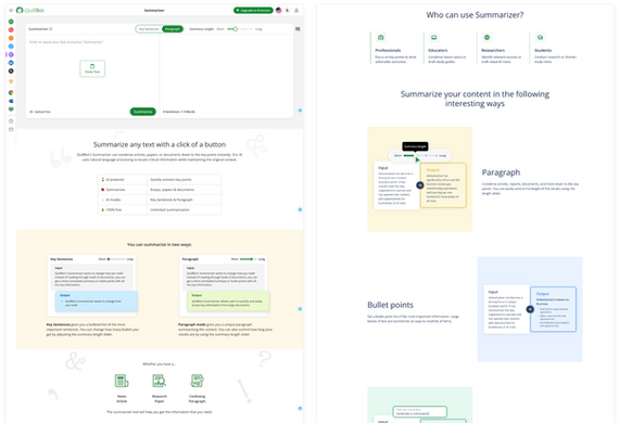
QuillBot home and product page redesign
Problem
Inconsistent visual design, poor branding and less than 1% of users explored other products from the sidebar. Users and employees alike called the visual design old and ugly.
Solution
The homepage was restructured, removing the paraphraser canvas adding conversion elements such as MacOS, CTAs, and social proof. Feature-specific content was replaced with user benefits, aligning with modern, high-converting homepage patterns.
Outcome
Product discovery improved by 35% from the introduction of the product tiles and from a cleaner sidebar. The tiles also helped communicate QuillBot is more than a paraphraser, but a writer's toolkit broadening the value perception for users.
Role: UX lead co-lead with the Brand Director
Click the image to view lightbox & descriptions
Masonite.com site redesign
Problem
The website poorly drove conversion and was a catalog-like website made for sales agents and suppliers not residential homeowners. The site also lacked a mobile experience.
Solution
Design a desktop and mobile experience showing casing the "beauty of doors" meeting homeowner and general contractor door solution and purchasing needs.
Outcome
The digital product leadership team praised the freshness of the design and how doors are the focus on every page that inspires users to purchase a Masonite door. Features of the redesign were adopted by Design and Marketing.
Role: Lead UX designer + researcher
ADT Pulse Redesign
Problem
Speed, unreliable connectivity, confusing navigation, no troubleshooting help, and missing features drove negative comments.
Solution
Redesigned the app using continuous discovery with a internal feedback team to easily manage connected devices, monitor security and notify owners of home activity for peace of mind.
Outcome
App ratings changed from 1.2 stars to 5 stars in under 3 weeks with 1 million downloads.
Role: Lead UX designer and researcher
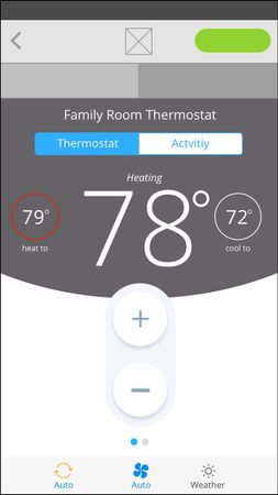
ADT Pulse Climate Control Redesign
Problem
The interactive radial dial and button groupings were difficult to use that many customers complained about.
Solution
The radial dial was replaced with simple to use buttons up and down buttons, approved by Mr. Hingson, a visually impaired customer.
Outcome
The redesign earned rave reviews for its clear layout, accessible controls, and easy temperature adjustments, improving user satisfaction, confidence, and overall engagement across all customer segments.
Role: Lead UX designer and researcher
Gemini interaction concepts for dynamic org-charts
Problem
Most HR org-chart management softer lacks a smooth way to zoom in/out of org structures.
Solution
Inspired by Google Maps' zoom model, I created an efficient system for navigating organizational charts, allowing seamless transitions between high-level and detailed views.
Outcome
The ease of zooming in & out of an org chart increased sales by 70%.
Role: Lead UX designer and researcher
Adding the popular Layaway features to Sears
Problem
The original digital design of the famous Kmart Layaway program, now part of Sears had a complicated UX frustrating customers.
Solution
The workflow group similar activities and the UI was refreshed significantly improving the user experienced resulting in a strong financial returns.
Outcome
The $1 million milestone was reached four months ahead of the anticipated 12-month goal.
Role: Lead UX designer
Click the image to view lightbox & descriptions
Need help?
Range of Redbox research studies
Problem
The organization lacked the voice of the customer in regard to pain points, values and motivations.
Solution
I established the UX Research group creating feedback loops into product for continuous improvements and customer insights. We performed a range of generative and evaluative research studies.
Outcome
UX research evolved into a pivotal component of our product development strategy, playing a crucial role in prioritizing both short-term and long-term initiatives in the US and Canada.
Role: Lead UX designer and researcher


